
The Drop is a fundamental and differentiating component within our design system. We use it as a graphical element in patterns, masks, and illustrations to reinforce our brand when opportunities emerge, but please resource the below guidance to ensure it is represented correctly.
Imagery and video
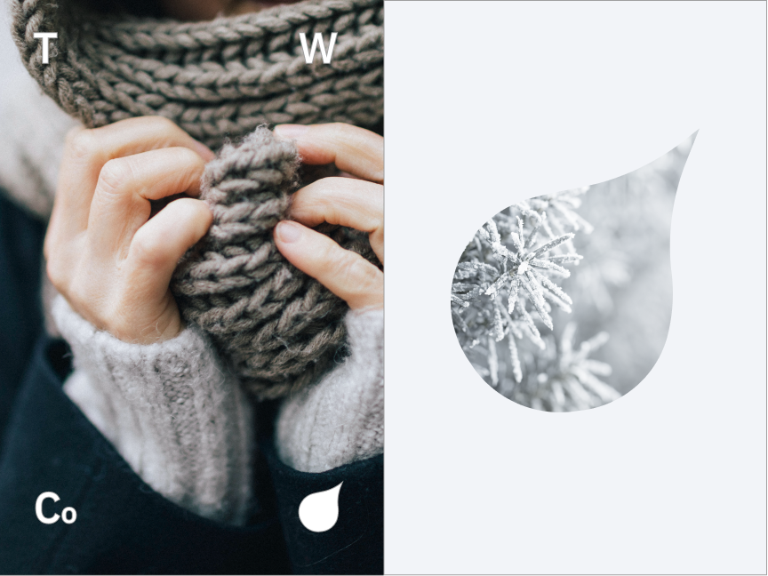
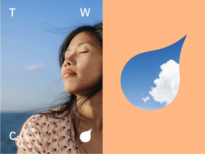
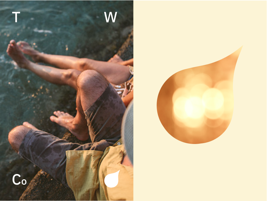
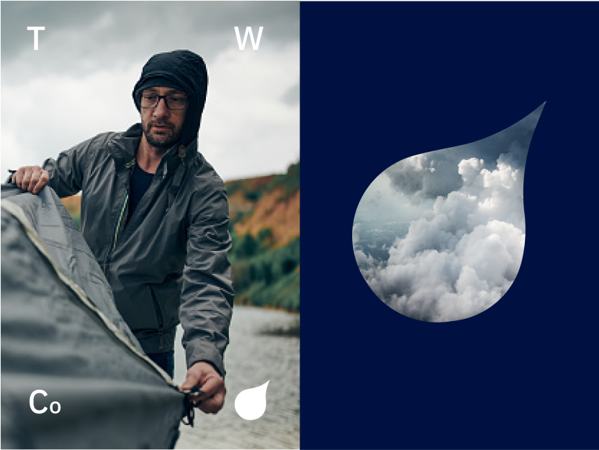
Use the drop as a portal or mask to images. When doing so, be cognizant of color. We have found that keeping the surrounding color as a complimentary color or of the same palette typically makes for the best results.
Back Drops
The drop is great element in backdrops for murals, desktops, or floor graphics.
Be sure to reference the color guidance when selecting multiple colors for designs.


Cropped Drop
In some instances we crop the “Drop” to make use of the curve as a container. In these cases there is a threshold in where it still retains it’s recognition as a drop shape that includes the top curve at the top tip, and the exterior curve.
Use the “s-curve” that includes the curves both at the top and side of the drop when using it as a design container.
Don’t crop in too tight that the drop is completely unrecognizable.
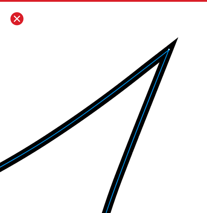
Drop outline
There are circumstances where we can outline the “Drop.” When doing so be sure to not make the stroke too thick. Here are a couple do’s and don’ts to look out for. If looking to execute an outline of the “Drop” please reach out to the Creative Marketing Department for additional assistance.
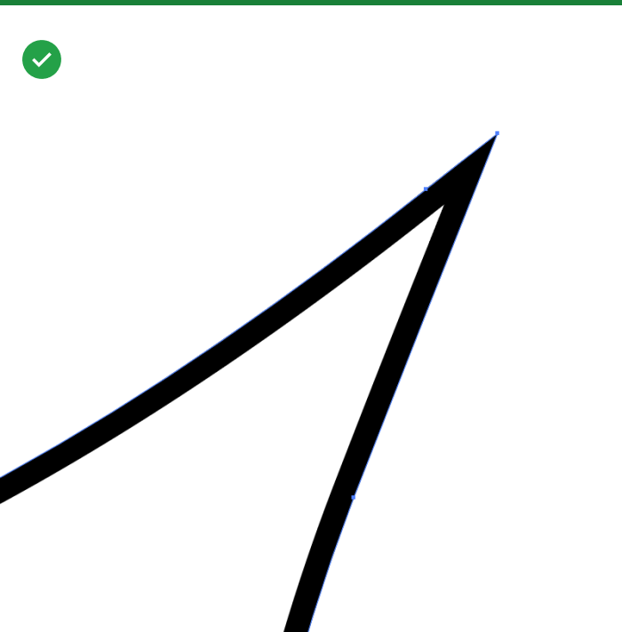
To retain the stroke shape, use the stroke setting that aligns the stroke to the inside of the “Drop”
Don’t use any stroke alignment outside of the shape of the “Drop”